Pawfect Hero

Project Overview

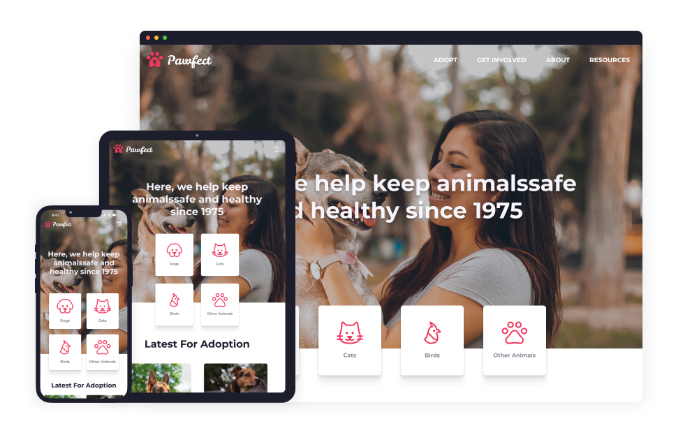
Pawfect Animal Shelter is an open-admission facility drive to make lives better for animals and people. The project aim to create the responsible website for Pawfect in order to better place every healthy and safe animal for adoption. In the project's first stage, we are creating a new responsive website and the full adoption flow for Pawfect to view and process the application online.

Project Duration

November 2022 to December 2022

Pawfect Overview Image

The Problem

The current adoption flow consists of phone calls and paperwork. Scheduling the interview with applicants is inefficient

The Goal

Design a fully responsive website for Pawfect. The adoption process can be applied and scheduled online.

My Role

I am the UX designer designing the Pawfect website from conception to delivery.

Responsibilities

I conducted interviews, paper and digital wireframing, low and high-fidelity prototyping, usability studies, accounting for accessibility and iterating on designs.

UNDERSTANDING THE USER

I conducted interviews and created empathy maps to understand the users I was designing for and their needs. The user group identified through research were animal lovers, pet owners, and shelter staff. The research found that those user groups cover a wide range of ages; Most of them tend to visit the animal shelter on-site when there is a need for adoption. But they will go online to check out shelter information beforehand. Having a good user experience on the website is crucial to delivering reliable information to users. Also, an online adoption application can replace the current paper process, which will clarify the adoption process.

Responsiveness.

The current website is built with old tech, and users are having trouble viewing the website from mobile devices

Apply.

The current application process is onsite. Applicants have to travel to the shelter and fill out forms

Process.

The staff of the shelter is burdened with paper works and telephone calls

IA.

An entirely restructured IA is needed to show the mission and value of the shelter and a more straightforward process for adoption applicants

Persona 1 Emma
Persona 2 Chris

STARTING THE DESIGN

Paper Wireframes

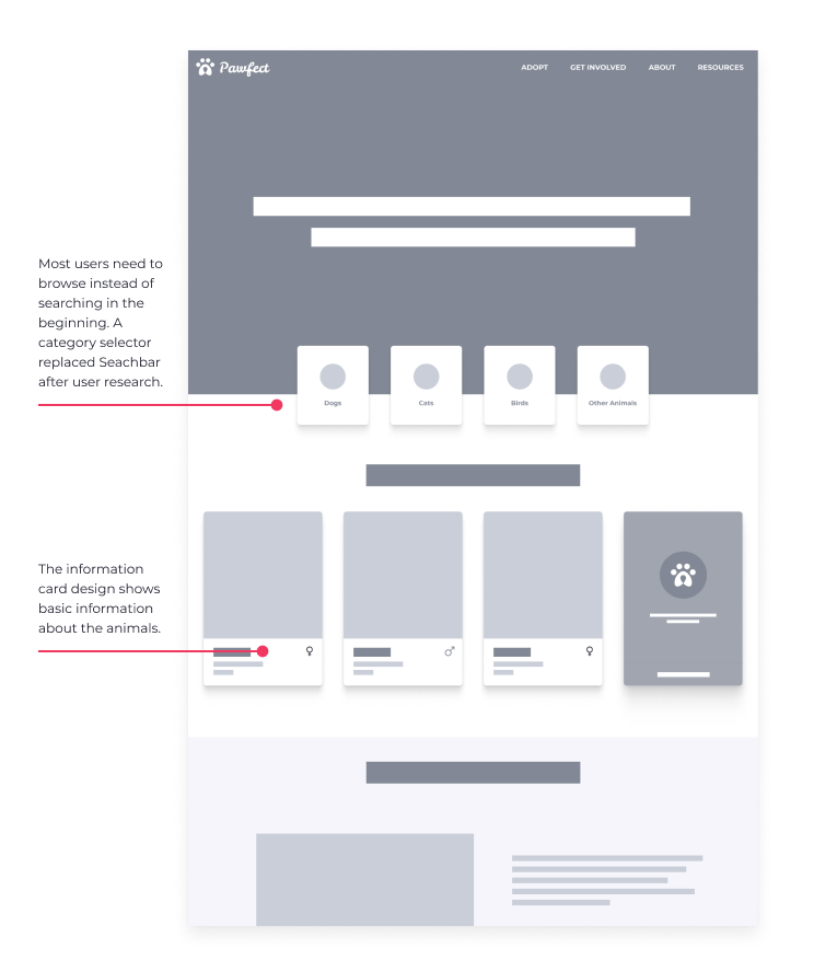
I use a traditional website structure for the home screen to create a clean information structure and friendly feeling for a mass audience.

I use a traditional website structure for the home screen to create a clean information structure and friendly feeling for a mass audience.

Digital Wireframes

Home landing designs based on feedback and findings from user research.

Home landing designs based on feedback and findings from user research.

A more minimal way to show all the animals.

A more minimal way to show all the animals.

Low-fidelity Prototype

The low-fidelity prototype connected the primary user flow of animal adoption.

The low-fidelity prototype connected the primary user flow of animal adoption.

Usability Study Findings

I conducted two rounds of usability studies. Findings from the first study helped guide the designs from wireframes to mockups. The second study used a high-fidelity prototype and revealed what aspects of the mockups needed refining.

Round 1

  • Users want to see more picture of pets
  • Users need simpler adoption application flow.
  • Users need to know what to do after submiting application

Round 2

  • Users want to know about the adopt process.

REFINING THE DESIGN

The early design was packed with cards. After the usability studies, the page layout is optimized for more breading space. Scroll to load is placed by pagination.

The early design was packed with cards. After the usability studies, the page layout is optimized for more breading space. Scroll to load is placed by pagination.

The new design enabled users to see more photos and videos of the animals. The new layout restructured the IA to be more straightforward.

The new design enabled users to see more photos and videos of the animals. The new layout restructured the IA to be more straightforward.

Mockups

High Fidelity Prototype

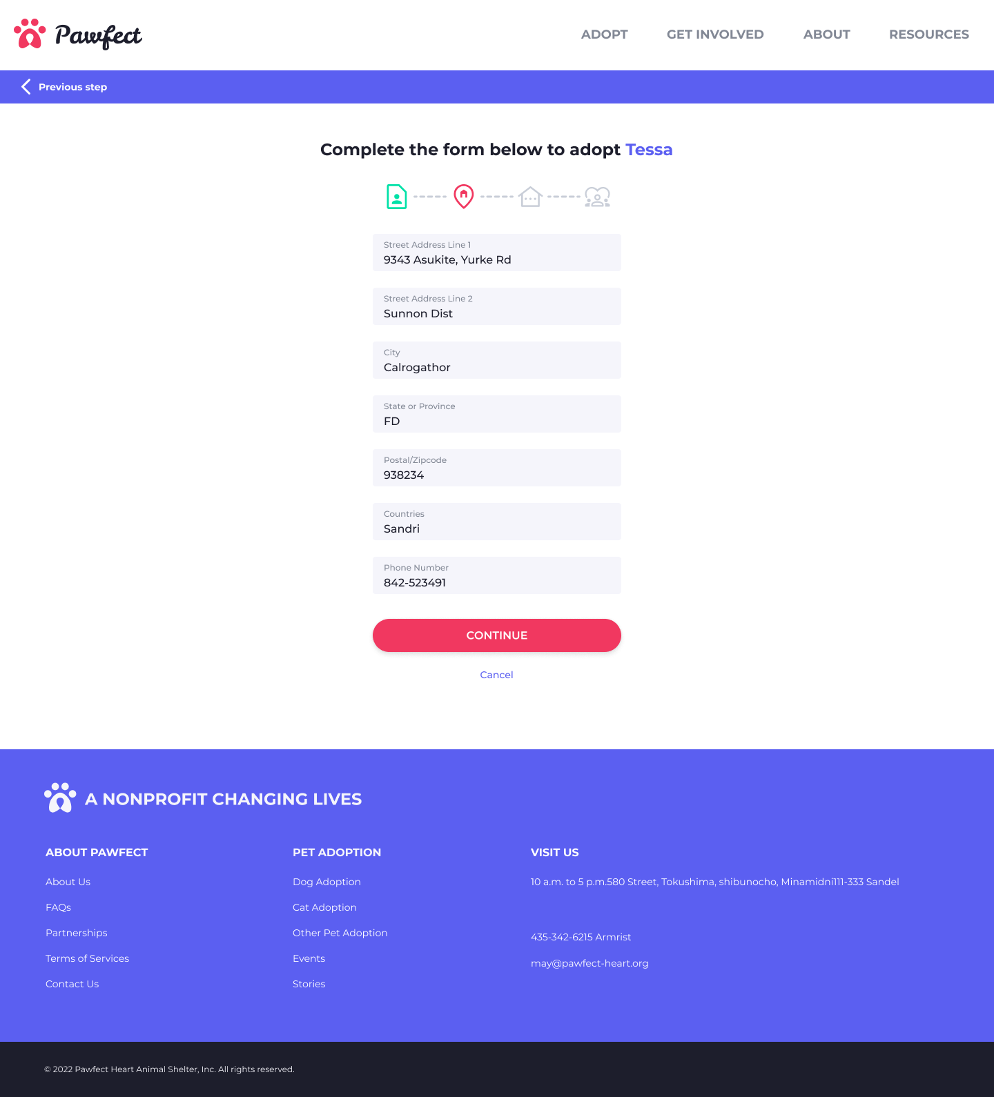
The final high-fidelity prototype presented the full online adoption application flow.

Pawfect High-fidelity Prototype

Accessibility Considerations

With web accessibility support, use a Logical heading structure for the screen reader and screen magnification.

Reduce the text, use negative space, and use shadows to lift the imagery. Making the images pop out from the page helps the user focus on the pictures and browse faster.

Using easy-to-understand icons for small operations helps to reduce information density and make the page more readable.

GOING FORWARD

Impact

By building a more user-friendly adoption flow and website help to strengthen the bond between shelter and target users.

What I learned

While designing the website, I practiced creating a responsive web app from scratch and iterating the design solution through usability studies.

I adopted Charlie for my kids using the website. The process is quick.

-- One quote from peer feedback

Case Study Date: December 2022