Bitsy Tree Hero Image

Project Overview

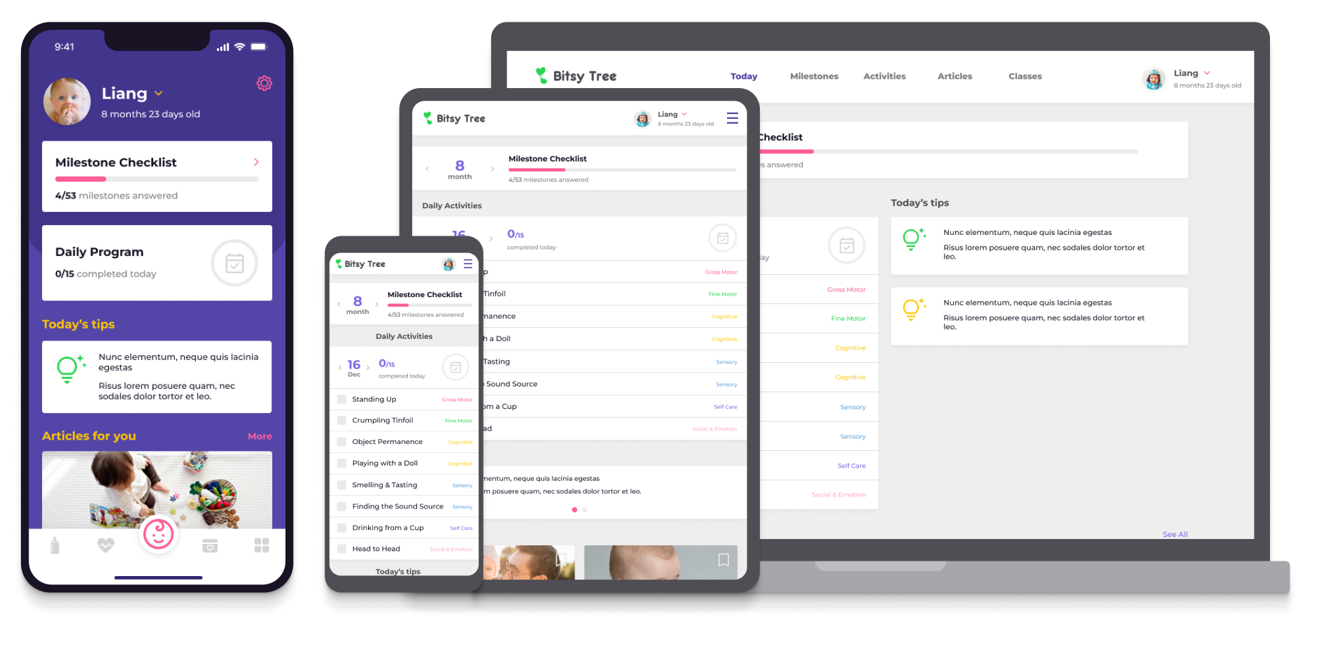
Bitsy Tree is an app concentrated on helping young adults learn about being first-time parents. It delivers detailed information and tutorials on each stage of the baby's growth. In addition, it comes along with a comprehensive tracking tool. Offline workshops from local Paediatrics & Child Health Services are suggested based on location.

Project Duration

December 2022 - January 2023

Bitsy Tree project overview image

The Problem

Few apps supply detailed and applicable tutorial-based information about parenting. The instruction is too scattered and unordered. Most tools in the AppStore are either overly complex or have broken user experiences.

The Goal

Design an app and a fully responsive website for Bitsy Tree. Young parents can track their babies using the built-in tool. The platform will provide practical information based on the baby's growth data.

My Role

UX designer designing the mobile app and web app for the Bitsy tree from conception to delivery.

Responsibilities

Conducting interviews, paper and digital wireframing, low and high-fidelity prototyping, conducting usability studies, accounting for accessibility, and iterating on designs.

UNDERSTANDING THE USER

I conducted interviews and created empathy maps to understand the users I am designing for and their needs. The user group identified through research were young new parents who are busy and just have their first child. Research find that although most new parents search for parenting insights online, but most online information is unstructured. They want a more structural and engaging approach or tool to guide their throughout the new journey of being a parent.

Information.

Parenting information is too scattered, unordered, or not relevant.

Tools.

Most tools are too complex to use and have broken user experiences.

Tutorial.

Most parenting information is pieces of advice based on a blog post. It's hard to extract practical instructions and put them into practice.

Subscription.

Most services require a subscription to access the most basic functionalities.

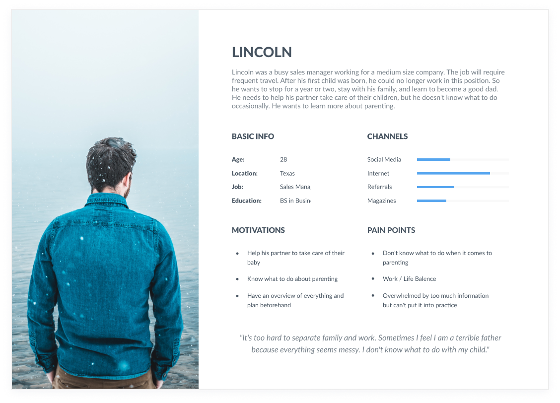
Lincoln is a new dad who helps care for his child and needs to know all the problems he could face during a specific period because he wants to be prepared and help his wife when needed.
Claire is a new mom who takes care of my child and manages a part-time job who needs to get practical parenting insights after logging her child's growth data because she want to make everyday parenting more manageable.

STARTING THE DESIGN

Paper Wireframes

For the home screen, I prioritized to present the to-dos, checklists, tips, and newest parenting resources for parents.

For the home screen, I prioritized to present the to-dos, checklists, tips, and newest parenting resources for parents.

Digital Wireframes

Home screen design based on user research and findings.

Home screen design based on user research and findings.

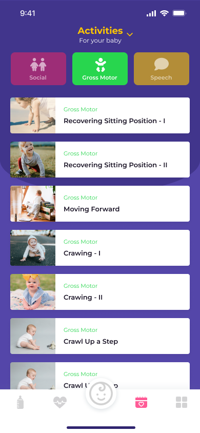
Activities are selected based on children age.

Activities are selected based on children age.

Low-fidelity Prototype

To prepare for usability testing, I created a low-fidelity prototype that connected the user flow of viewing an item about to expire and using it in a recipe.

To prepare for usability testing, I created a low-fidelity prototype that connected the user flow of viewing an item about to expire and using it in a recipe.

Usability Study Findings

I conducted one rounds of usability studies. The findings helped guide the designs from wireframes to mockups.

Round 1

  • Activities categories can optimized to be cleaner and less confusing
  • The self check interaction is too similar to milestone check, which causes confusion
  • Milestone should have monthly filters to review previous months

REFINING THE DESIGN

In early design, the complete list of activities and activities for the user's baby was on the same level, which caused confusion. After user research, the complete list is hidden and defaults to one level deeper.

In early design, the complete list of activities and activities for the user's baby was on the same level, which caused confusion. After user research, the complete list is hidden and defaults to one level deeper.

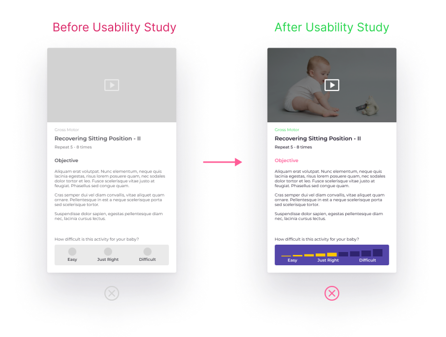
Too many check-like types of interaction confuse users. After the usability study, the check interaction changed to drag and set value interaction.

Too many check-like types of interaction confuse users. After the usability study, the check interaction changed to drag and set value interaction.

Mockups

High Fidelity Prototype

The high-fidelity prototype followed the same user flow as the low-fidelity prototype, including design changes made after the usability study.

Bitsy Tree High Fidelity Prototype

Accessibility Considerations

Clear labels for interactive elements that screen readers can read.

Initial focus on personalized recommendations to give new parents insights for better parenting.

GOING FORWARD

Impact

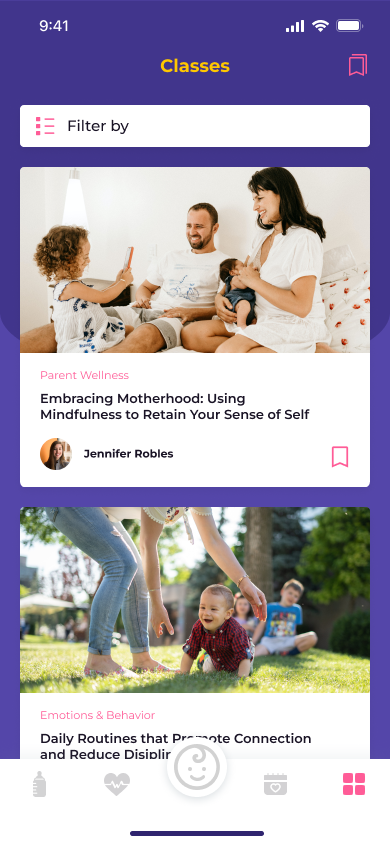
The app uses a step-by-step and engaging approach to educating new parents about most detail of different stages of parenting. Users are also able to get more expert insights from articles and classes.

What I learned

I learned that even though the problem I was trying to solve was a big one, diligently going through each step of the design process and aligning with specific user needs to be helped me come up with solutions that were both feasible and useful.

As a first-time mommy, I was lost with what to do with my newborn until I discovered this app.

-- One quote from peer feedback

Case Study Date: Feburary 2023