Hero image for the Nonsense Explorer Project

Project Overview

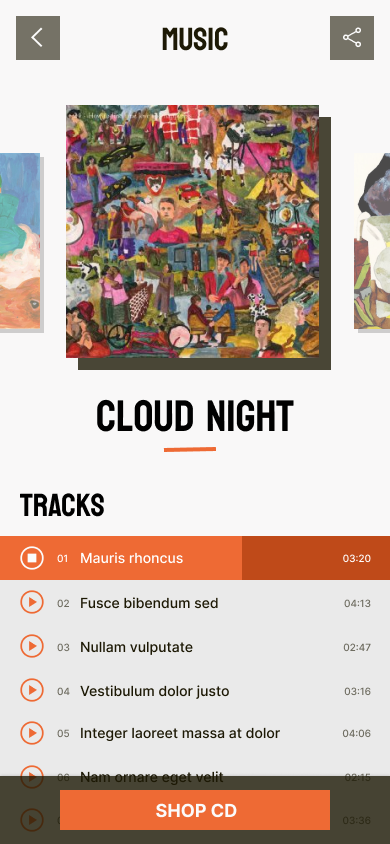
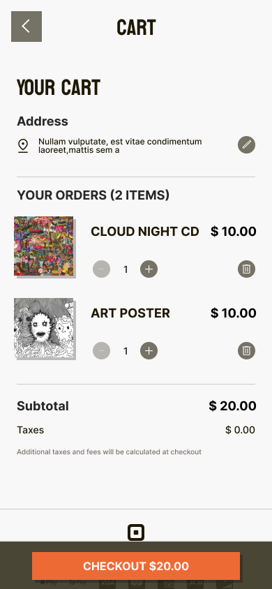
Nonsense Explorer is an Asia-based indie rock band under the record label Fabricated music. The official web app aims to present its strong branding and music creation and further build international recognition. The web app needs an online listening and shopping feature at the first stage so visitors and fans can listen to their music and purchase merchandise such as album CDs and Art posters directly from the web app.

Project Duration

October 2022 to December 2022

Nonsense Explorer Project overview image

The Problem

The band has a static official site, but it's designed unprofessionally and built with old tech.

The Goal

Design an official web app that professionally presents its identity to music fans or agencies. Also, have the function listen to their music and purchase merchandise from the online shop at the project's first stage.

My Role

I am the UX designer who designed the official web app for Nonsense Explorer from conception to delivery.

Responsibilities

I conducted interviews, paper and digital wireframing, low and high-fidelity prototyping, usability studies, accounting for accessibility and iterating on designs.

UNDERSTANDING THE USER

I conducted interviews and created empathy maps to understand the users I was designing for and their needs. The user group identified through research were current fans who follow their favorite musicians online. The research found that this user group is the young generation; they will search for music in this genre and listen to and buy CDs online. They need a one-stop for getting all solutions. The research also revealed that how many features inside the official app were not the only factor limiting users from knowing about the musicians. The user will browse through different artists quickly and choose the one with the most robust trustable identity first and then listen further to music second. It's challenging to grasp visitors at first sight.

Identity.

A strong, unique, and trustable visual identity is crucial to grasping the users and growing a more extensive fan base

Listen.

Most indie bands’ web doesn’t have a music listening feature. Users must purchase third-party music services, then search and listen to their music

Shop.

The band members need a place to sell their CDs and album art posters, so they don’t need to set up and build a third-party service separately

IA.

The IA should connect music listening and music-related items shopping

Tyler is an indie music fan who needs a more friendly and mobile way to listen to his favorite band because the content from the band currently is too separate and outdated online.

STARTING THE DESIGN

Paper Wireframes

For the home screen, I prioritized presenting a strong brand identity with a unique layout design and showing the newest music from the band, along with other most important and recent information.

For the home screen, I prioritized presenting a strong brand identity with a unique layout design and showing the newest music from the band, along with other most important and recent information.

Digital Wireframes

Home landing designs based on feedback and findings from user research.

Home landing designs based on feedback and findings from user research.

By removing the digital version purchase, users can now listen to the music quickly and free from the official app, which is vital for successful online promotion.

By removing the digital version purchase, users can now listen to the music quickly and free from the official app, which is vital for successful online promotion.

Low-fidelity Prototype

The low-fidelity prototype connected the primary user flow of selecting albums, listening to tracks, and buying CDs from the online shop.

The low-fidelity prototype connected the primary user flow of selecting albums, listening to tracks, and buying CDs from the online shop.

Usability Study Findings

I conducted two rounds of usability studies. Findings from the first study helped guide the designs from wireframes to mockups. The second study used a high-fidelity prototype and revealed what aspects of the mockups needed refining.

Round 1

  • Users are less likely to buy the digital version of music from a less famous band. Being free to listen gives a better chance to be shared and promoted.
  • Users want a better and clearer music listening experience.
  • A shorter route to shop for items

Round 2

  • The color can be optimized

REFINING THE DESIGN

Early designs allowed for purchasing the digital version of music, but after the usability studies, the digital version purchasing needs to be removed. I also redesign the page for a better listening experience only.

Early designs allowed for purchasing the digital version of music, but after the usability studies, the digital version purchasing needs to be removed. 
I also redesign the page for a better listening experience only.

The second usability study revealed that the color contrast of the overall app looks a bit “dirty” and needs to be optimized. I change the color from gray to light gray so that the overall design is cleaner, making the graphic content pop out more and also making the content easier to read.

The second usability study revealed that the color contrast of the overall app looks a bit “dirty” and needs to be optimized. I change the color from gray to light gray so that the overall design is cleaner, making the graphic content pop out more and also making the content easier to read.

Mockups

High Fidelity Prototype

The final high-fidelity prototype presented a cleaner user interface with a shorter route of purchase flow.

High-fidelity Prototype

Accessibility Considerations

With web accessibility support, use a Logical heading structure for the screen reader and screen magnification.

Reduce the text, use negative space, and use shadows to lift the imagery. Making the images pop out from the page helps the user focus on the pictures and browse faster.

Using easy-to-understand icons for small operations helps to reduce information density and make the page more readable.

GOING FORWARD

Impact

The app presents the band to the musical world with a unique, professional, reliable quality. It’s a stepping stone for the career of the band.

What I learned

While designing the official web app for Nonsense Explorer, I learned the entire process of creating an app from scratch and iterating the design solution through usability studies.

After listening to the music, I like the band's style. And I feel safe buying something from the app.

-- One quote from peer feedback

Case Study Date: Nov 2022